Skip to content
Case Studies
Services
Interior Designers
Insights
About
Contact
Case Studies
Services
Interior Designers
Insights
About
Contact
CASE STUDIES
Success Stories
Brand
Digital
Strategy
All
View
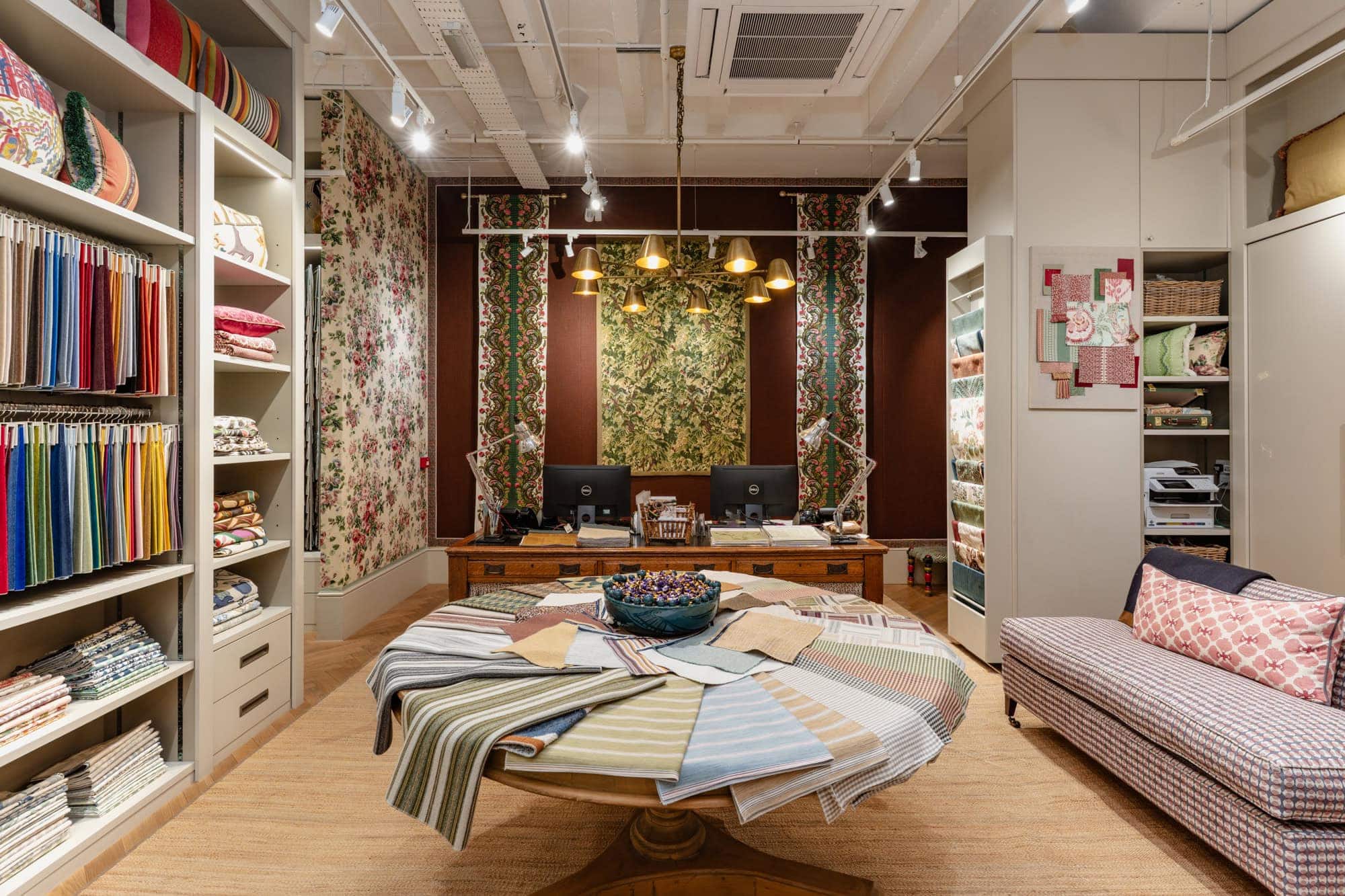
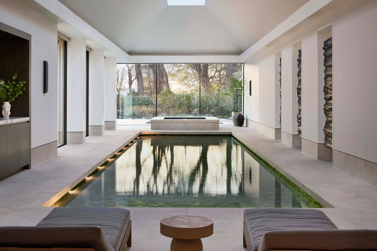
Turnell & Gigon
Designing a new visual identity and digital experience for a historic fabric supplier
Brand
Digital
Strategy
Rupert Bevan
Creating a new website and brand for a bespoke furniture maker
Brand
Digital
Strategy
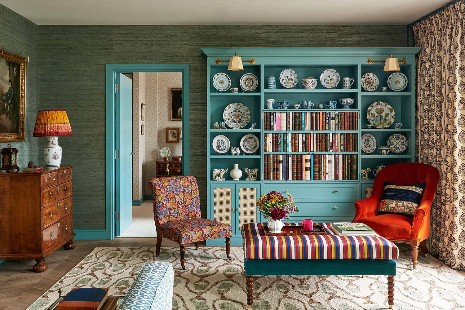
Henri Fitzwilliam-Lay
Crafting a unique brand identity and online presence for a multi-award winning interior studio
Brand
Digital
Strategy
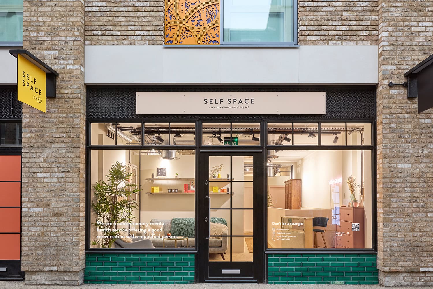
Self Space
Bringing a challenger brand to life in the mental health space
Brand
Digital
Strategy
Beata Heuman
Crafting an industry leading e-commerce solution for one of the UK's most celebrated interior designers
Digital
Strategy
Heanly Harris
Brand transformation for a British interiors studio with a rich heritage
Brand
Digital
Strategy
London Design Group
Branding and website for an established, award-winning, London-based interior design studio
Brand
Digital
Business Design Centre
Strategy, user experience and website redesign for an iconic venue in the heart of London
Brand
Digital
Strategy
Bernard London
Website and positioning for a leading architectural interior design studio
Digital
Strategy
Vanrenen Hanbury
Brand transformation for a distinguished British interior designer
Brand
Digital
Anna Spiro
Branding and e-commerce platform for one of the world's most inventive interior designers
Brand
Digital
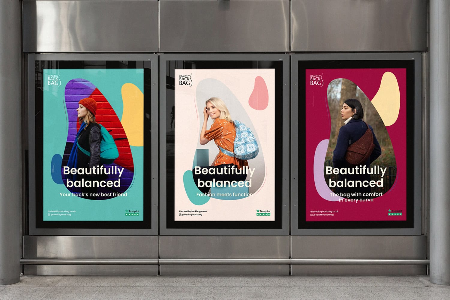
Healthy Back Bag
Realigning a medicinal product into an aspirational fashion brand
Brand
Digital
Strategy
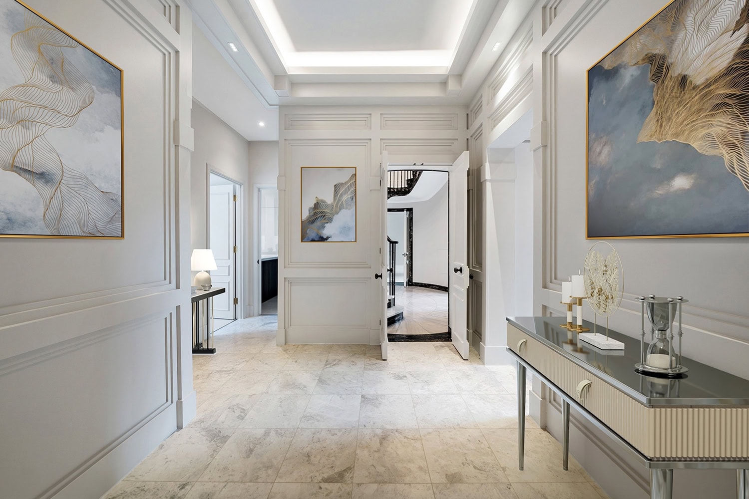
Bloomsbury Construction Group
Establishing a powerful brand identity and website for a super-prime construction firm
Brand
Digital
HotelHub
Redesigning the website for the world's leading hotel booking software tailored for TMCs
Digital
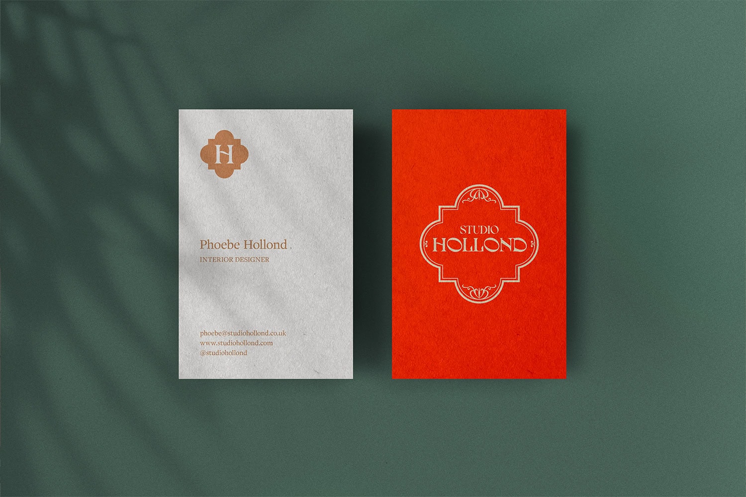
Studio Hollond
Crafting a visual identity and website for a luxury boutique interiors studio
Brand
Digital
Grace Hinchen
Shopify website design and development for a Hamptons-based, fine-art photographer
Digital
Strategy
Tasha Freeman
Brand transformation for a renowned British interior designer and ceramicist.
Brand
Digital
Flora Soames
E-commerce website design and development for a prominent British interior designer
Digital
Strategy
Dishmatic
Website and packaging design for a leading international FMCG brand
Brand
Digital
Festival of Media
Delivering online transformation for one of the world's leading media award programmes
Digital
Intelligent People
Strategy, brand and website for one of the UK's most trusted product management recruiters
Brand
Digital
Strategy
Case Studies
Services
Interior Designers
Insights
About
Contact
Case Studies
Services
Interior Designers
Insights
About
Contact