With many different font types to choose from, we look at deciding between a slab vs script typeface.
Slab Fonts
A Slab font, also known as slab serif, is a variant of the serif typeface and is best characterised by its super thick, blocky serifs. Its serifs can be angled, blunt or rounded.
In the 19th century, the number of slab typefaces grew alongside the rise of printed advertising. Letterforms developed from traditional serif fonts, becoming bolder and “fatter”. Well-known slab typefaces include Clarendon, Courier and Rockwell.
Slab typefaces are best suited for display type and large headlines, with their super heavy forms making them ideal for drawing attention, however, slab fonts should be used in moderation. When overused, such as in long sentences or paragraphs, they typically become difficult to read due to their heavy weight.
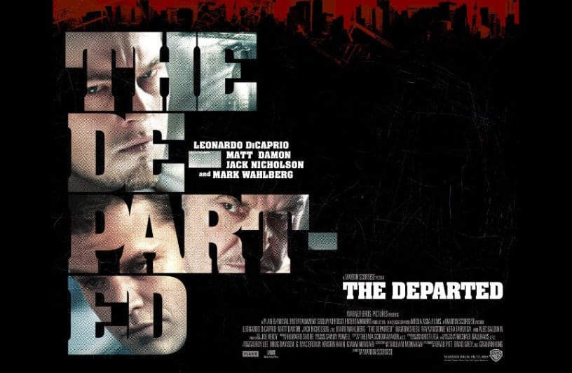
Practical uses of slab fonts include using them as filled letters. The thick letterforms allow them to accommodate masked images much better than script or traditional serif fonts.
Slab fonts can be paired with serif or sans serif typefaces. Strong combinations include:
- Chaparral (Display) / Open Sans (Body)
- Rockwell (Display) / Bembo (Body)
- Clarendon (Display) / Futura (Body)
- Roboto Slab (Display) / Roboto (Body)
Script Fonts
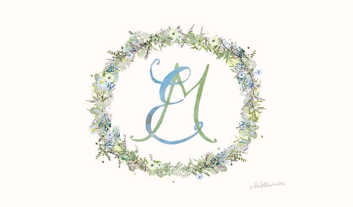
Script typefaces are based on the varied strokes and curves created by handwriting. They are arranged into two categories: formal scrips and casual scripts.
Script fonts are amongst the least commonly seen styles within web and app design. Their styles can be difficult to scan and are most typically used for display text, rather than for body copy. Scripts can be exceptionally difficult to read at smaller point sizes or if used within areas of limited space.
When used well, script fonts are ideal for conveying emotion. The associated emotion depends also on the elements they are used with.
Formal script fonts are frequently used in invitations to convey an elevated and elegant feeling.

Casual scripts are less formal and tend to appear to have been created with a web brush rather than a pen. Font weights and strokes can vary in width. Casual scripts are also frequently used in invitations to convey a rustic or whimsical feeling.
Script fonts are best used when paired with other font styles, most notably serif. Strong Slab vs Script combinations to try include:
- Memoriam (Display) / Futura (Body + Sub Headings)
- Yellowtail (Display) / Open Sans Light and Bold (Body + Sub Headings)
- Great Vibes (Display) / Oswald (Body + Sub Headings)
- Grafolita Script Bold (Display) / Garamond (Body + Sub Headings)
Further reading: Serif vs Sans: Know your Font types PT1