As business owners and brand designers, we intuitively know that being memorable and unique is far more powerful than blending into the background. Creative businesses that want to stand out from the crowd know that differentiation is essential. Yet, as our design agency expands and works with more and more interior designers and various other creative entrepreneurs, we notice that differentiation has become less of a priority, as the trend towards ‘blanding‘ has taken (deep) root.
With the sea of options that customers have to choose from in modern times, why aren’t more brands taking the opportunity to swim against the tide?
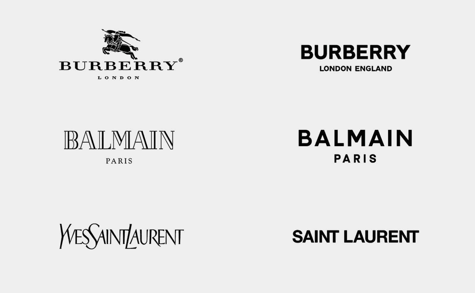
The rise of generic logos
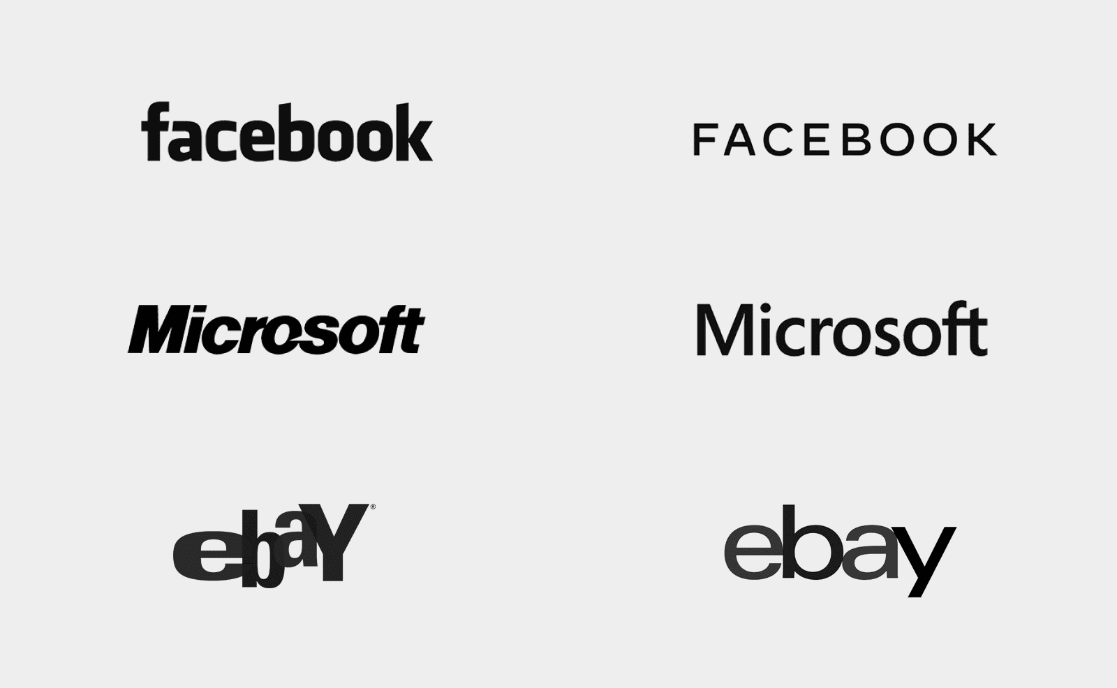
The trend is marked by a few key characteristics; most of the logos we come across look remarkably similar – often simple and stripped back designs with generic fonts that lack personality – such as sans serif typefaces, minimal, muted colour palettes and no overly intricate detailing. It has become so commonplace that it is often difficult to distinguish one logo from another without taking a closer look. And this can be seen in everything from websites to packaging and business cards.
We understand the lean towards this aesthetic. This look essentially says: “I’m a professional and I can be trusted”. It says, “I’m modern, I’m competent, and I’m easy to understand”.
But unfortunately, it also says “I’m boring. I’m safe. I’m Predictable.” It does not do much in terms of giving your brand a unique edge or personality, which is key to forming a genuine relationship with customers, which increases their lifetime value to the brand.
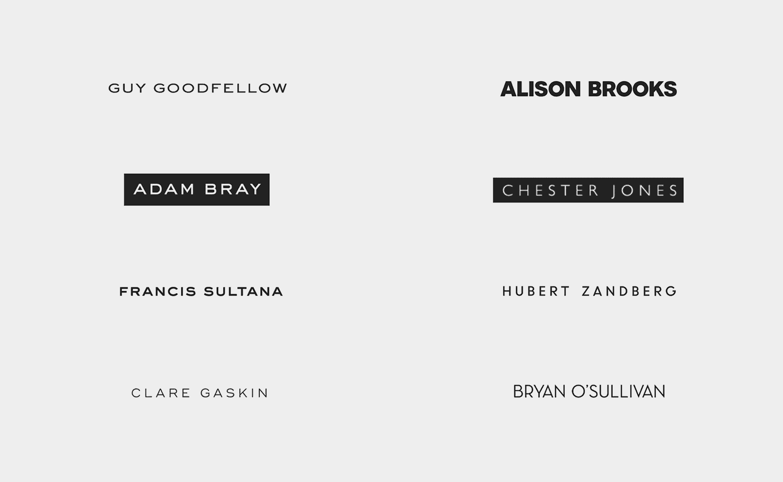
A quick glance at the House & Garden Top 100 interior designers shows a disappointing trend towards sans-serif logotypes with no logo mark or point of difference. Many of these logos could be swapped with a competitors font style and the change itself would go unnoticed.
A closer look at bland brand practices
The reasons for the rise of blanding are multifaceted. There is a pervasive over-reliance on trends in digital media such as sans serif fonts, simple colour palettes, and stripped back branding. These trends can be great – but only if they are used smartly within the context of an engaging and well-crafted brand. A cleaner look requires less time and design aesthetics have been simplified due to desktop and mobile display constraints. Modern marketing strategies, digital media and consumer behaviour mean that many brands feel that if they appeal to as many people as possible, by sticking to ‘safe’ branding elements, they will make more money.
It’s also likely that brands are using this trend as a way to gain trust – the idea being that customers will feel more comfortable with a brand they perceive to be simple, trustworthy and professional. However, there’s a very fine line between building trust in this way and completely blending into the background – and it’s important to remember that without a strong presence, brands can easily be forgotten among all the noise.
Another factor that might come into play is cost-effectiveness that comes with making a logo or brand identity that follows certain trends and norms. The same font styles and colour palettes can be used across multiple projects, allowing them to save time and money. This can come at the cost of originality, however, which is something that should always be kept in mind.
The art of crafting a unique identity
Creating an original and impactful brand requires a certain level of creativity and originality. It requires tapping into a brand’s unique personality and finding a way to communicate it through visuals. Here are a few practical tips for avoiding bland branding and creating something truly unique:
- Invest more time in the design process – be true to your brand values, and take the time to really understand your target audience and what they want (and don’t want).
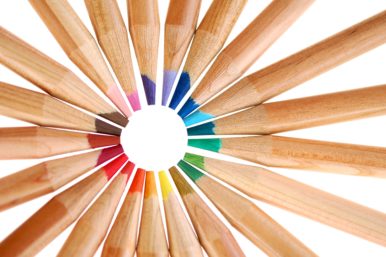
- Experiment with different aesthetics, such as abstract shapes, hand-drawn fonts, and vibrant colour palettes.
- Incorporate elements of storytelling into the design process – using symbolism to add depth and meaning to the visuals.
- Pay close attention to details such as spacing, typography, layout and hierarchy.
- Always remember the purpose of your brand identity – a logo is not just for looks, it’s about conveying meaning.
- Get feedback from customers and other stakeholders to ensure that the design resonates properly.
It can be daunting to push boundaries when creating visuals for a brand, but it’s important to remember that bland branding can be just as detrimental to your success.
The key is to find the perfect balance between being unique and professional – something that takes time and dedication, but is definitely achievable with the right approach. By taking the time to understand the target audience, brands have the potential to make a lasting impression and create a strong presence in the marketplace. With the right approach, it’s possible to create an identity that resonates with customers and helps businesses to succeed.
Brands that get it right
For all the talk of blanding, there are some brands that absolutely nail it and stand out in a crowded market. Here are some of our favourites.
Party Cannon
Death metal band Party Cannon forsake the typical logos and colour palettes associated with death and black metal and went 180 degrees in the other direction.
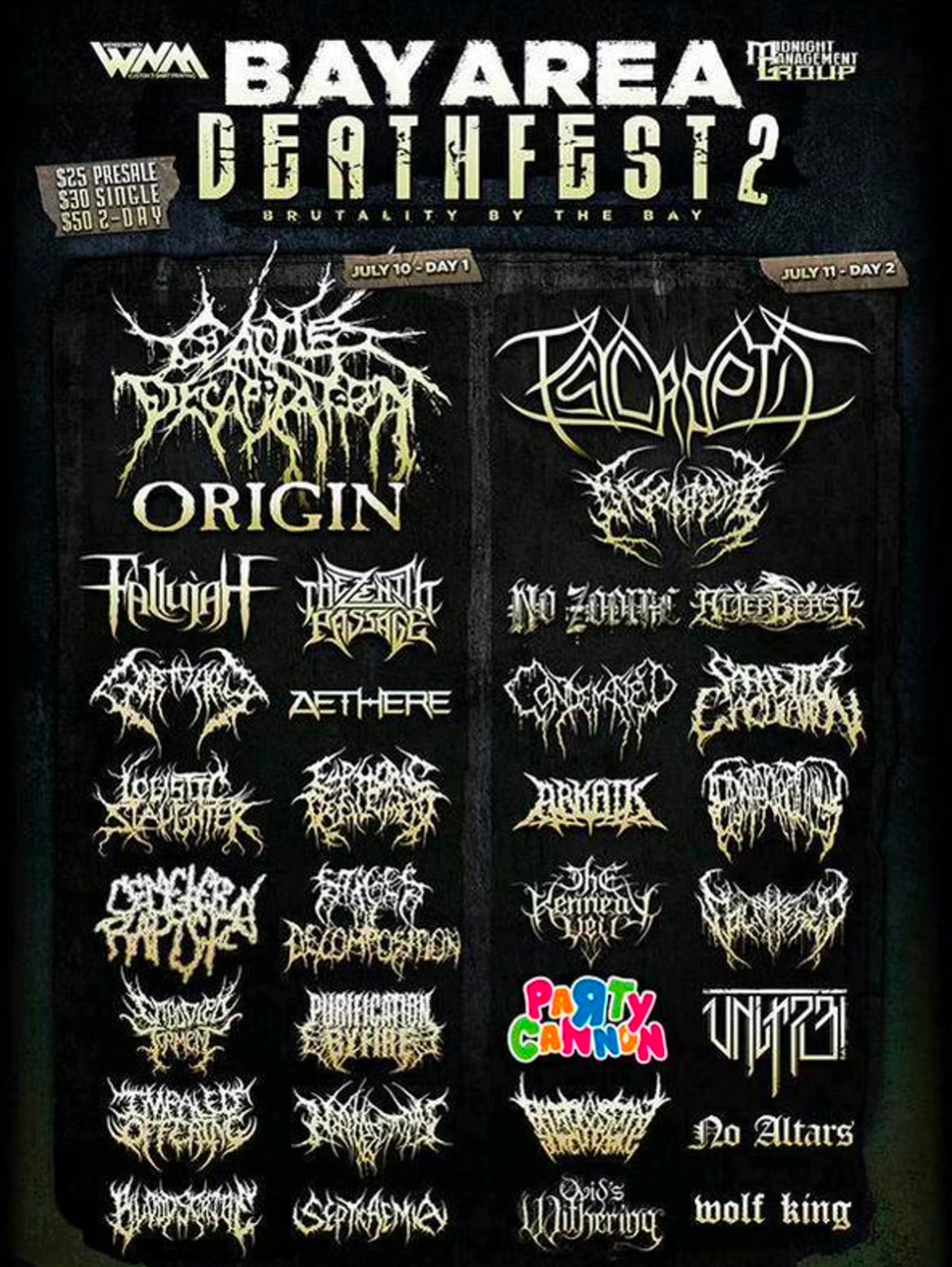
The result? Huge contrast and the right publicity for doing something original.
Vivienne Westwood
The iconic British designer has remained true to her punk and disruptive beginnings. While other fashion houses changed to sans-serif fonts, Westwood’s logo remains unique and full of character.
Tate
It would be easy for a museum or art gallery to opt for a minimalist typeface logotype. Tate’s logo, redesigned by Wolff Olinns in 1999, went against the cultural norms associated with galleries. Their “blurred” logo reflected the changing nature of art, but that it still remained the Tate.
The logo was updated in 2016 (above) but still retained the message at heart. The switch from blurring to dots allowed the logo to work better on digital platforms and in other settings. An animated version of the logo includes the dots moving around like a constellation, then coming together to form the Tate logo. Spot on!
Looking for a brand refresh?
A compelling brand identity isn’t just for the big boys. Any business can have a brand identity that sets them apart from their competitors and conveys the right message to their audience.
Get in touch with March today. We’ll tell your brand’s best story.