Knowledge of font types will not only will it help you decide complementary type pairs – but it will also help you to clearly explain design decisions and rationale to your clients. In this article, we look at Serif vs Sans fonts and the primary differences of each style.
Serif Fonts
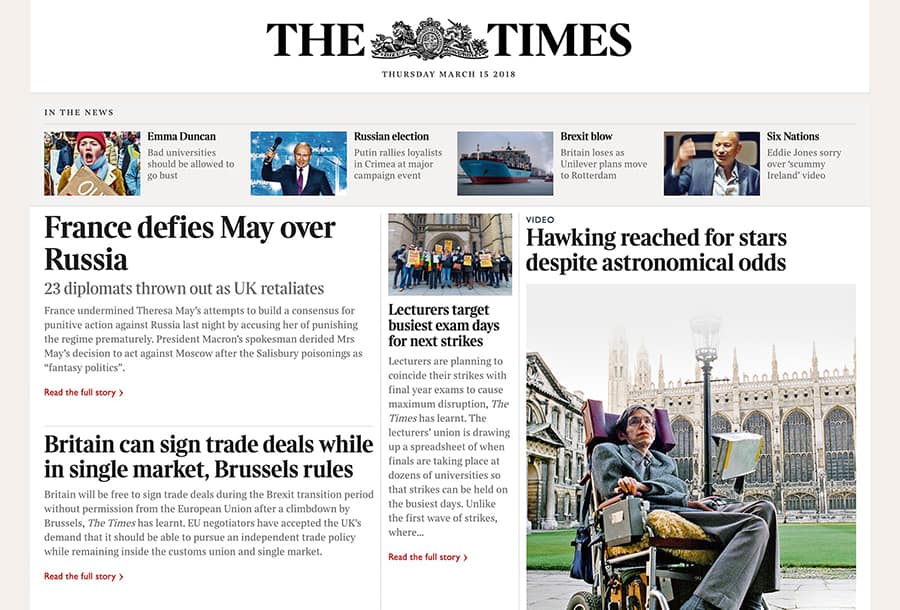
Serif fonts are amongst the most popular forms of type and also the most traditional. A serif is a small line attached to the end of a stroke in a letter or symbol. These small lines can vary in length and weight and can be straight or angled. A typeface containing serifs is classed as a serif typeface. Some sources also refer to serif typefaces as “Roman”, for example, “Times New Roman”.
The serif style is most famously used for typesetting within print such as newspapers and books. It is most suitable for body text and large display text.
Historically, web and motion designers steered clear from serif fonts due to their clarity on screen, for instance, before the days of smartphones, tablets, and HDMI, most computer and television screens ran at a relatively low resolution of 72 dots per inch, meaning that small serifs were unclear and impaired legibility. This is less often the case now as most smart devices and have a resolution of 220dpi and above.
When using serif fonts, try to limit your design to no more than 2 typefaces to avoid looking haphazard.
Sans Serif Fonts
Sans is a French word that translates to “without”.
As the etymology suggests, sans serif typefaces lack any embellishment on the letters, adopting a more simplified form. Sans serif letters can be thick or thin, short or tall, wide or condensed. The best sans serif fonts have sets at least 6 – 8 different weights, ranging from Ultralight (the thinnest) to Black (the thickest).
Often referred to simply as “sans” fonts, their style is equally adept for display fonts and body copy. The greatest usage, however, is within digital. The versatility of sans serif fonts and legibility on digital screens means they are the most prominently used style across websites and apps.

Their ease of legibility resulted in road and transport signage being changed to sans serif. Motorists have just a few moments to read and recognise signs –– for this reason, they are generally in Title Case sans, for instance, in the UK the standard font is Transport while the New York metro system was famously converted to Helvetica.
Pairing Serif and Sans Serif Fonts
Serif fonts can be paired with sans serif fonts to harmonise and complement your design. When used in a well-considered manner the combination of Serif vs Sans can result in striking visuals.
Some excellent Serif / Sans Serif font pairings include:
- Garamond / Helvetica
- Utopia / Proxima Nova
- Cardo / Josefin Sans
- Minion / Avenir

Continue Reading: Know your font types Part II: Slab vs Script