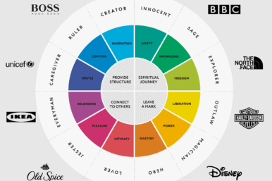
Colour is a crucial aspect of branding that can make or break a business’s success. It is not just about making something look pretty or aesthetically pleasing, but rather, it is a powerful tool for building brand identity and communicating with consumers. Choosing the right colour palette can have a significant impact on how your brand is perceived and remembered.
As a London branding agency, we understand the importance of choosing the right colours to communicate your message effectively to your target audience. In this post, we will explore the power of colour in branding and provide tips for choosing the right colour palette for your business.
The Psychology of Colour in Branding
Colour psychology is the study of how colours affect human behaviour, emotions, and perception. The colours you choose for your brand can elicit specific emotions and reactions from your target audience. This is why it is essential to consider the psychological impact of colour when creating your brand identity. Here are some of the most common colours and their associated emotions:
Blue: Trust, security, and professionalism

Green: Health, growth, and nature

Red: Passion, energy, and urgency

Yellow: Happiness, optimism, and warmth

Purple: Luxury, sophistication, and creativity

Orange: Fun, excitement, and affordability

Black: Elegance, sophistication, and power

White: Simplicity, purity, and cleanliness

Of course, the emotional impact of a colour can vary depending on the context in which it is used. For example, red might communicate urgency and excitement in the context of a sale or promotion, but it might also be associated with danger and warning in other contexts.
What are Brand Colours?
Brand colours are the specific colours that a brand uses in all its communications, including logos, website, marketing materials, and packaging. Consistency in the use of brand colours is essential to build brand recognition and create a memorable brand identity. It is vital to choose colours that reflect your brand’s personality, values and messaging.

5 Tips for Choosing the Right Colour Palette for Your Brand
Here are some tips to help you choose the right colour palette for your brand:
1. Consider Your Industry and Competitors
It’s important to consider the colours commonly used in your industry, as well as those used by your competitors. This will help you create a unique colour palette that stands out while also fitting in with industry expectations. For example, a business in the health and wellness industry might use calming greens and blues to communicate a sense of tranquillity, while a business in the technology industry might use bold, modern colours to convey innovation.
2. Think About Your Target Audience
Consider the demographic you are trying to reach and the emotions you want to evoke in them. For example, if you’re targeting a younger audience, brighter, more vibrant colours might be appropriate. If you’re targeting a more mature audience, softer, more muted colours might be more effective.
3. Test Your Colour Palette
Before committing to a specific colour palette, it’s important to test it with your target audience. You can use surveys or focus groups to get feedback on different colour combinations and see which ones are most effective at communicating your brand identity.
4. Use Contrast to Your Advantage
Contrast can help your brand stand out and make a lasting impression. Consider using complementary colours, which are opposite each other on the colour wheel, to create a bold, eye-catching colour scheme.
5. Don’t Overdo It
While colour is a powerful tool for branding, it’s important not to overdo it. Using too many colours can be overwhelming and dilute your brand’s message. Stick to a few carefully chosen colours that work well together to create a cohesive, memorable brand identity.
TL;DR
Understanding colour in branding can have a significant impact on how your brand is perceived and remembered. By considering the psychological impact of colour, your industry and competitors, your target audience, and the importance of contrast and simplicity, you can create a powerful colour palette that effectively communicates your brand identity. Remember, the goal of a good colour palette is to make your brand memorable, unique and recognizable, and to help you stand out in a crowded marketplace.
Sources:
The Psychology of Color in Marketing and Branding. https://99designs.co.uk/blog/marketing-advertising/psychology-color-marketing-branding/
Colour in branding: what every business should know. https://www.igd.com/articles/article-viewer/t/colour-in-branding-what-every-business-should-know/i/23329
The Power of Branding and How It Can Impact Your Business. https://www.forbes.com/sites/ashleysheikh/2021/03/26/the-power-of-branding-and-how-it-can-impact-your-business/?sh=60f7e0686b36
Color Theory for Designers: How To Create Your Own Color Schemes. https://designshack.net/articles/graphics/color-theory-for-designers-how-to-create-your-own-color-schemes/
The Importance of Color in Marketing. https://www.huffpost.com/entry/the-importance-of-color-in_b_11543258.


