One of the most common topics we discuss with our clients is the use of Pantone vs CMYK. While the majority of our projects are suitable for printing in a CMYK colour space, others require the use of Pantone or Pantone mixed with CMYK.
Determining which print process to use typically comes down to a number of factors including brand recognition, impact, production time and budget.
Here we take a look at both processes and the pros and cons of each.

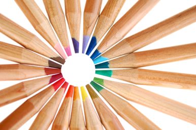
CMYK Colours
CMYK is short for Cyan, Magenta, Yellow, Black. Also known as process or full colour, CMYK is the most popular method of printing. Colours are created by layering a combination of the four colours together.
CMYK is best suited for:
- Photo printing and photorealistic imagery
- Multicolour images
Home printers and commercial printers go with CMYK to print texts and images. Similarly, most magazines and newspapers are printed using CMYK.
CMYK uses a series of dots in the four colours to create images and colours. That method means that a wide variety of colours can be used in a small area. If you try zooming in on a printed picture you’ll notice little dots of colour (half-ton-ing) padded over one another. This padding of tiny dots is what creates the impression of a solid colour.
CMYK’s limitation is that it cannot produce the same vibrancy that can be achieved with Pantone or on-screen colours (RGB). The other downside is consistency – CMYK colours can look different on each printer and even within the same document.
Pantone Colours
Often referred to as Pantone Matching System (PMS) or spot colours, Pantone is a proprietary colour space created by Pantone Inc.
The system uses a similar technique to house paints, where each colour corresponds to a number and a swatch sample. By standardising colours, different manufacturers in different locations can refer to the Pantone system to make sure colours match, even when they’re unable to compare samples visually. This ensures a visual consistency that is often lacking with CMYK.
Pantone is best suited for:
- Precise colour matching for branding and logos
- Vibrant hues and darker tones
- Special finishes including fluorescent and metallic colours
Pantones are best suited for logos and business stationery, which could be anything from a letterhead to the branding on a Formula 1 car. Governments around the world have adopted the PMS to specify national flag colours for instance.
Print quality is generally much better and more accurate with Pantone than CMYK, however, this is reflected by the price. With Pantone you pay per number of colours and also by coverage area. Pantones should be used for single spot colours or a small handful of colours, so they would never be used to print photographs for instance.
When we create identities we typically define a Pantone that best matches the brand colour. We then provide CMYK and RGB fallbacks to compliment the brand for in-house printing and screen use.
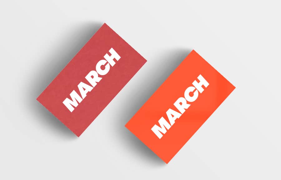
CMYK to Pantone
Our own business cards were printed in Pantone 805. You can see the difference in vibrancy between the CMYK to Pantone versions below:
Choosing a brand color has implications for every business, from its brand reputation to economics. At March we collaborate with our clients to define brand colours and source print providers. If you would like us to help define your next branded project or source print please get in touch.
Further Reading: How we used Pantone to brand Stem Cell Fairy